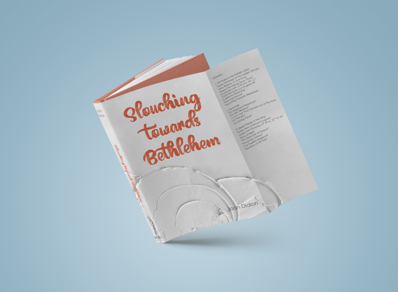
Joan Didion Book Covers
Industry: Publishing // Book Cover Design
Services: Print & Marketing Design // Typography
-
Analog
-
Reminiscent
-
Quiet
-
Refreshing
-
Tactile
- Analog - Reminiscent - Quiet - Refreshing - Tactile
Brief
Joan Didion’s works from the 1960s and 1970s are timeless classics, but their existing designs don’t resonate with younger readers. The goal was to breathe fresh life into her iconic books by creating visually striking book jackets that reflect the essence of Didion’s writing while honoring her legacy. The designs needed to feel both modern and classic, drawing new readers into the quiet introspection and vivid landscapes that characterize her work.
The Solution
The reimagined book jackets balance homage and innovation, ensuring the designs resonate with both longtime fans and new readers:
• California-Inspired Textures: The covers incorporate tactile visuals that evoke the raw, natural beauty of California landscapes so prevalent in Didion’s work, grounding the design in her storytelling.
• Subtle, Introspective Palette: A nearly blank background creates quiet space, inviting readers to project their own introspection into the design, much like Didion’s writing invites reflection.
• Continuity Through Text and Color: Colors within the text maintain a visual connection to previous editions, ensuring the redesign feels familiar while fresh.
The Results
The final branding brought Body Positive Nutrition Counseling’s mission to life in every detail. The waving shapes and vibrant colors created a sense of movement and energy, while the diverse photography and typography underscored their welcoming message. The custom-coded website made it easy for potential clients to find them online, navigate their services, and feel immediately at ease. Across stationery, marketing materials, and signage, the brand’s cohesive identity left a lasting impression of warmth, excitement, and inclusivity.
The Book Covers


